new
improved
User Interface Enhancements
As our journey to enhance and simplify our user interface picks up pace, we are thrilled to release the first steps on that journey.
This release includes three new updates to our user interface that will simplify navigation around the platform, fast track some of your critical workflows and add a little more interest and personalisation. They cover:
- The use of profile pictures or avatars wherever a user is mentioned
- The ability to 'create' new actions, feedback, contacts etc from anywhere in the platform
- A simplification and refresh of the main platform banner to ensure the most useful features are easily accessible
Profile Pictures

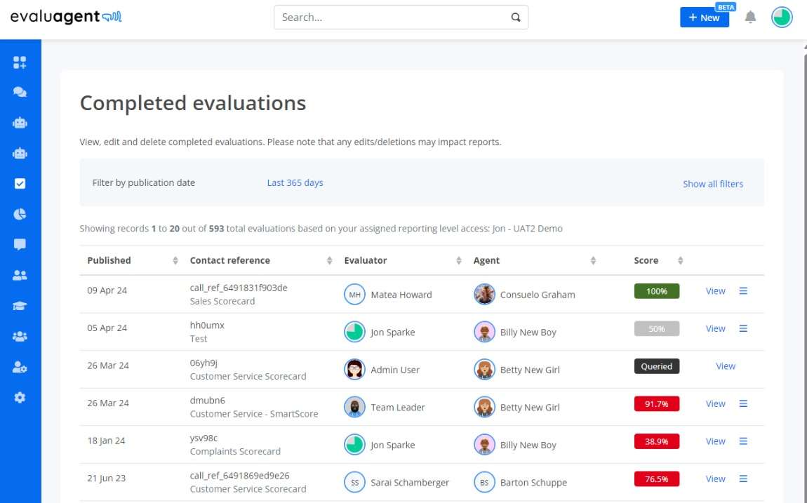
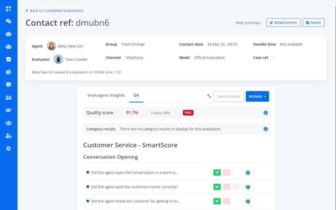
You've been able to create your own profile picture or avatars for a while now, but with this latest update your profile images will be shown proudly across the whole platform wherever a specific user is mentioned. That might be in completed evaluations, KPI reports or evaluations themselves.

Create New Button
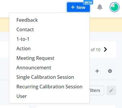
The create new button provides a direct short-cut to allow you to create new feedback, actions, contacts etc without needing to navigate to the specific menu option in the side-bar.
The ‘+ New’ button is visible on the main header banner from wherever you are in the evaluagent platform making it much simpler and faster to create those new assets you need.

What options you can see are controlled by the permissions that your user has. The full list currently of possible ‘new’ assets to create is as follows:
- Feedback – create new general feedback for another user
- Contact – create a new contact to evaluate
- 1-to-1 – create a new 1-to-1 meeting with a member of your team
- Action – create a new action to assign to another user
- Meeting Request – Create a request for a meeting
- Announcement – create a new announcement to be shared across your teams
- Single Calibration Session – create a single one off calibration session
- Recurring Calibration Session – create a regular recurring calibration session
- User – create a new single user or bulk upload of users
UI Banner Simplification
The main banner within the evaluagent platform is visible from any page. We have reduced the number of icons that appear on this banner and moved the platform search tool to a much more central and prominent position so that its always there when you need to search the platform.

You'll see that the notification icon is still visible next to your profile picture but other functions such as 'Help' can now be found under your profile picture, simply click on the profile picture to access this menu.